Understanding statistics and probability is essential for professionals like data analysts, data scientists, machine learning engineers, and C-suite leaders. These disciplines are key to making data-driven decisions, uncovering trends, and predicting outcomes. In business operations, an introduction to statistics and probability can enhance forecasting accuracy, optimize decision-making, and predict customer behavior effectively.
This guide provides an introduction to statistics and probability, demonstrating how they empower professionals to make informed, evidence-based decisions. From descriptive and inferential statistics to probability models, we’ll cover key concepts that support better decision-making. Let’s review the table of contents to see what’s ahead.
Table of Contents
1. Introduction to Statistics and Probability: Why It’s Important
What Are Statistics and Probability?
Statistics is the science of collecting, analyzing, interpreting, and presenting data, while probability measures the likelihood of events occurring. Together, they form a powerful toolkit for uncovering hidden patterns, trends, and insights within numbers. For data professionals, an introduction to statistics and probability provides the foundation for tasks like building machine learning models, identifying business trends, optimizing operations, and making data-driven decisions. By understanding these disciplines, professionals can transform raw data into actionable insights that drive growth and innovation across industries.
Want to dive deeper? Explore AI Fundamentals: A Beginner’s Guide for a solid foundation in artificial intelligence.
Why Statistics and Probability Matter for Data Professionals
For data professionals, statistics and probability are essential for making informed, data-driven decisions. They enable you to:
- Extract actionable insights: Understand data, identify key trends, and make evidence-based decisions.
- Build predictive models: Forecast future outcomes and refine business strategies using statistical methods and probability concepts.
- Manage uncertainty: Use probability to quantify risk and make better decisions under uncertain conditions.
Without a strong foundation in statistics and probability, even experienced professionals may overlook critical trends or make inaccurate predictions, negatively impacting business performance.
The Role of Statistics and Probability in Data-Driven Decisions
In today’s data-driven world, statistics and probability are indispensable tools for unlocking the true potential of data. By applying statistical analysis and probability theory, businesses can:
- Identify emerging trends: Understand customer preferences and adjust strategies in real time.
- Predict future outcomes: Use probability-based models to make informed decisions, from refining sales forecasts to anticipating market shifts.
- Optimize resources: Make smarter decisions about where to allocate time and capital, improving efficiency.
For example, analyzing past marketing campaigns with statistical methods helps businesses fine-tune ad targeting, optimize spend, and maximize return on investment. Similarly, probability models can predict the likelihood of customer conversions, helping businesses allocate resources effectively. Statistics and probability are not just about gathering data; they are about transforming it into actionable insights that drive growth and enhance business operations.
2. Descriptive vs. Inferential Statistics
Statistics is broadly divided into two types: descriptive statistics and inferential statistics. Each serves a distinct purpose, and together they provide the tools needed to analyze, interpret, and make decisions based on data. Let’s explore these concepts further with modern, detailed examples.
Descriptive Statistics
Descriptive statistics focus on summarizing and describing the main features of a dataset, answering the question: “What is happening in the data?” By using metrics such as the mean, median, variance, and standard deviation, descriptive statistics provide a clear snapshot of the data, helping to identify trends, patterns, and key characteristics quickly and effectively.
Think of descriptive statistics as a movie review: it summarizes the plot, performances, and ratings without revealing every scene. Similarly, descriptive statistics provide an overview of a dataset’s main characteristics.
Key Techniques in Descriptive Statistics:
- Measures of Central Tendency:
These include:- Mean (Average): The sum of all values divided by the total number of values.
- Median: The middle value in an ordered dataset.
- Mode: The most frequently occurring value.
(We’ll explain these concepts in detail in the Basic Statistical Terms section.)
- Measures of Spread:
- Range: The difference between the largest and smallest values.
- Variance: Measures how far values are from the mean.
- Standard Deviation: The square root of variance, showing how spread out the data is.
(These will also be covered in detail in the Basic Statistical Terms section.)
Example:
Imagine you run a coffee shop and track daily sales for a month. By calculating the average number of cups sold per day (mean), identifying the busiest day (mode), and measuring how sales vary day-to-day (standard deviation), you can summarize and understand your shop’s performance. These insights help you make decisions like adjusting staff schedules or planning promotions for slower days.
Inferential Statistics
Inferential statistics go beyond simply describing the data. It helps you draw conclusions and make predictions about a larger group, or population, based on a smaller subset, or sample. It answers the question: “What can this data tell us about a larger group?”
Think of inferential statistics as tasting a spoonful of soup to decide if the whole pot needs more salt: it relies on a small sample to make assumptions about the whole. Similarly, inferential statistics draw conclusions about a population based on a sample.
Key Techniques in Inferential Statistics:
- Estimation:
Using sample data to estimate population parameters (e.g., population mean or proportion). - Hypothesis Testing:
Testing assumptions or claims about a population (e.g., “Is the average customer rating above 4.0?”). - Confidence Intervals:
Providing a range of values likely to include the true population parameter. - Regression Analysis:
Identifying relationships between variables (e.g., how temperature affects sales).
Example:
Now, let’s say you introduce a new coffee flavor and survey 100 customers to see if they like it. If 80% of the surveyed customers give positive feedback, inferential statistics allow you to predict that about 80% of your entire customer base would likely enjoy it too. This helps you decide whether to keep
3. Understanding Distributions: Patterns in Data
A distribution describes how data points are spread across a range, providing a clear picture of patterns and variability. It helps answer critical questions: Are most values clustered around a central point, or are they spread out? Are there outliers, and if so, how do they affect the data?
One of the most common types of distributions is the normal distribution, often called the bell curve. In this pattern, most data points are concentrated around the mean (average), with fewer values appearing as you move toward the extremes. This shape is frequently observed in natural phenomena, such as test scores, heights, or customer purchase frequencies. For example, in a classroom, most students may score close to the class average, with only a few scoring exceptionally high or low.
Distributions can also show asymmetry, known as skewness. A right-skewed distribution has a longer tail on the right, indicating that higher values are more spread out. This is common in income data, where a small number of people earn significantly more than the majority. Conversely, a left-skewed distribution has a longer tail on the left, often seen in datasets like exam grades where most students score high, but a few perform poorly.
Why Distributions Matter
Distributions are essential for understanding the underlying characteristics of your data. They help identify key features like:
- Center: Where the data tends to cluster (mean, median, mode).
- Spread: How much the data varies (range, variance, standard deviation).
- Shape: Symmetry, skewness, or unusual peaks in the data.
For businesses, understanding distributions can uncover actionable insights. For instance:
- Customer Trends: A distribution of customer spending might reveal a small group of high-value customers driving most sales (Pareto principle).
- Risk Analysis: In finance, distributions help predict market volatility or assess the likelihood of extreme losses.
- Operational Efficiency: In logistics, analyzing delivery times as a distribution can identify bottlenecks or delays.
Real-World Example
Imagine you’re analyzing delivery times for an e-commerce company. A histogram shows that most deliveries occur within 2-4 days, but there’s a long tail with a few taking 7+ days. This right-skewed distribution highlights potential inefficiencies in the shipping process, prompting further investigation into outliers to improve overall service.
Want to learn more about distributions? In our next article, we’ll dive deeper into advanced concepts like probability density functions, normality tests, and real-world applications. Stay tuned!
4. Basic Statistical Terms
Understanding key statistical terms is essential for working with data effectively. These terms fall into two main categories: measures of central tendency, which describe the “center” of your data, and measures of variability, which show how spread out the data is. Let’s explore these terms with relatable examples.
Measures of Central Tendency
Central tendency refers to the values that represent the middle or center of a dataset. These measures help summarize large datasets into a single value that describes the “typical” data point.
1. Mean (Average)
The mean is the sum of all values divided by the total number of values. It provides a general sense of the central tendency in your data. By summarizing a dataset into a single representative value, the mean allows you to quickly understand overall trends and make informed decisions.
The mean is calculated using the formula:
\( \text{Mean} = \frac{\text{Sum of Values}}{\text{Number of Values}} \)
Example: Imagine you own a flower shop and record the number of bouquets sold each day: 20, 25, 30, 35, and 40. The mean is:
\( \text{Mean} = \frac{20 + 25 + 30 + 35 + 40}{5} = 30 \)
On average, you sell 30 bouquets daily. This helps you plan inventory and staffing effectively.
The mean is particularly useful when data points are evenly distributed because it gives an accurate reflection of the dataset’s central value. For example, in a business setting, calculating the mean helps forecast future trends, set benchmarks, or assess overall performance, making it a valuable tool for decision-making.
2. Median
The median is the middle value when numbers are arranged in ascending order. It’s especially useful when your data contains extreme values (outliers) that could distort the mean. By focusing on the middle value, the median provides a clearer picture of the “typical” data point, ensuring that your analysis isn’t skewed by unusually high or low values.
Example: Suppose you’re tracking weekly bakery sales: 50, 55, 60, 65, and 300. The median is 60, the middle value. Unlike the mean, the median isn’t affected by the outlier of 300, providing a better representation of typical sales.
The median is crucial for analyzing data with large disparities. For example, when collecting income data in a village, the mean may be skewed by one wealthy individual, misrepresenting the typical earnings. The median, unaffected by extreme values, offers a more accurate view of the community’s economic reality, guiding better policy decisions.
3. Mode
The mode is the value that appears most frequently in a dataset. It helps identify what is most common, making it particularly useful for understanding patterns or preferences in a given population. Unlike the mean and median, the mode can be applied to both numerical and categorical data, making it versatile for analyzing datasets where popularity or frequency is the focus.
Example: A grocery store tracks the number of items purchased by customers: 2, 3, 3, 3, 4, 4, and 5. The mode is 3, showing that most customers buy three items. This insight can guide decisions like bundle promotions or stocking frequently purchased items.
The mode is valuable in retail, marketing, and customer analysis. For example, if a clothing store finds medium is the most purchased shirt size, it can adjust inventory accordingly. Similarly, identifying chocolate as the most popular ice cream flavor in a survey helps businesses align offerings with customer preferences, boosting satisfaction and efficiency.
Measures of Variability (Spread)
While measures of central tendency show the “center” of the data, measures of variability explain how spread out the data is around that center. They help you understand the consistency or diversity within the dataset, which is crucial for making informed decisions based on the data.
1. Range
The range is the simplest measure of variability. It is calculated by subtracting the smallest value from the largest value in the dataset. The range gives you a quick sense of the overall spread of the data, showing the difference between the highest and lowest values.
Example:
A car rental service tracks the number of cars rented daily: 10, 15, 20, 25, and 30. The range is:
\( \text{Range} = 30 – 10 = 20 \)
This tells you the difference between the busiest and quietest days. Understanding the range helps the service allocate resources effectively, such as adjusting staff levels or car availability on peak days.
The range provides a quick and simple way to understand variability, showing the difference between the highest and lowest values. However, because it doesn’t account for how data is distributed between these extremes, other measures like variance and standard deviation are often more reliable for deeper analysis.
2. Variance
Variance measures how far each data point is from the mean, capturing the overall spread of the dataset. A higher variance indicates that the data points are more spread out, while a lower variance shows that the data points are closer to the mean.
Formula for Variance:
\( \text{Variance} = \frac{\sum (x_i – \bar{x})^2}{N} \)
Where:
\( x_i \): Each data point
\( \bar{x} \): The mean
\( N \): Total number of data points
Example:
Suppose a delivery service tracks the number of orders over five days: 10, 15, 12, 18, and 20.
The mean number of orders is: \( \text{Mean} = \frac{10 + 15 + 12 + 18 + 20}{5} = 15 \)
- To calculate variance, find the squared difference for each data point from the mean, sum them, and divide by the total number of points:
\( \text{Variance} = \frac{(10-15)^2 + (15-15)^2 + (12-15)^2 + (18-15)^2 + (20-15)^2}{5} = 14 \)
A higher variance here would suggest fluctuating daily orders, whereas a lower variance would indicate more consistent numbers.
Variance helps measure how much data points differ from the average, capturing the overall spread of a dataset. However, because its units are squared, it can be less intuitive to interpret directly, which is why standard deviation is often preferred for clearer insights.
3. Standard Deviation
Standard deviation is the square root of variance. It brings the measure of variability back to the same units as the data, making it easier to interpret. A small standard deviation indicates that the data points are close to the mean (consistent), while a large standard deviation shows more variability.
Formula for Standard Deviation:
The formula for standard deviation is: \( \text{Standard Deviation} = \sqrt{\text{Variance}} \)
Example:
Using the variance from the previous example (14), the standard deviation is:
\( \text{Standard Deviation} = \sqrt{14} \approx 3.74 \)
This means the number of daily orders typically deviates by about 3.74 orders from the mean of 15.
Standard deviation offers a clearer understanding of variability, making it easier to interpret than variance. Businesses use it to evaluate the consistency of sales, delivery times, or customer experiences, while in finance, it helps measure investment risk and market volatility.
5. Data Types and Scales of Measurement
Before starting data analysis, it’s crucial to understand the types of data you’re working with and their scales of measurement. Each type of data requires specific methods of analysis and visualization, and choosing the right approach depends on understanding these concepts. Let’s break them down with relatable examples.
Data Types
Data is broadly categorized into two types: categorical and numerical. Knowing the difference helps you decide how to analyze and present your data effectively.
Categorical Data
Categorical data represents labels or groups that describe a characteristic or quality. These values are qualitative and not numerical in a meaningful sense. For example, in a survey about favorite ice cream flavors, responses like “vanilla,” “chocolate,” and “strawberry” are categorical data. Similarly, yes/no answers (e.g., “Do you like ice cream?”) and customer preferences such as payment methods (“cash,” “credit card,” or “mobile payment”) are also examples of categorical data.
Numerical Data
Numerical data represents quantities and can be measured or counted. This data is quantitative and involves meaningful numbers. For example, tracking the number of customers visiting a store each day (e.g., 50, 75, 100) or recording the daily temperature in a city (e.g., 22.5°C, 25.3°C, 28.1°C) are both examples of numerical data.
Numerical data can be further divided into:
Discrete Data:
Discrete data consists of countable values that cannot be divided into fractions or decimals. These values are typically whole numbers and represent items or events that can be counted in distinct units. For example, the number of items sold in a store (e.g., 1, 2, 3) or the number of people in a room (e.g., 5, 10, 15) are discrete data points because they can only take whole, countable values.
Continuous Data:
Continuous data includes values that can take any measurement within a given range, allowing for decimals and fractions. These values are often measured rather than counted and can be infinitely precise. For instance, the weight of a product (e.g., 1.5 kg, 2.75 kg) or the time taken to complete a task (e.g., 2.4 hours, 3.6 hours) are examples of continuous data because they can have values with decimal points for precision.
Scales of Measurement
Data is measured on four different scales: nominal, ordinal, interval, and ratio. Understanding these scales is essential for selecting the right statistical techniques and creating meaningful visualizations. Each scale represents data differently and influences how the data should be analyzed.
By recognizing the scale of your data, you can determine the appropriate methods to summarize, visualize, and interpret it. Let’s explore each scale and see how they apply in real-world scenarios.
Nominal Scale
Nominal data consists of categories that have no inherent order or ranking. These values are qualitative, meaning each category represents a distinct label or group. The data doesn’t hold any numerical value and cannot be arranged in a meaningful sequence.
For example, car colors like “red,” “blue,” and “green” are nominal data because there’s no sense of one color being greater or lesser than another. Similarly, labels such as “male” and “female” or responses like “yes” and “no” in surveys fall under nominal data, where each category is separate and equal in significance.
Ordinal Scale
Ordinal data represents categories that have a meaningful order or ranking, but the intervals between the categories are not consistent or measurable. This scale is often used to represent levels, preferences, or positions in a hierarchy.
For instance, customer satisfaction ratings such as “very satisfied,” “satisfied,” “neutral,” and “unsatisfied” are ordinal because the order matters. However, the difference between “satisfied” and “neutral” is not necessarily the same as between “neutral” and “unsatisfied.” Similarly, rankings in a race (e.g., first, second, and third) are ordinal, as they indicate positions but don’t quantify the gap between them.
Interval Scale
Interval data is numerical and has meaningful differences between values, but it lacks a true zero point. This means that zero does not represent the complete absence of the measured property. The intervals between data points are consistent, which allows for meaningful addition and subtraction.
For example, temperature measured in Celsius or Fahrenheit is interval data. The difference between 20°C and 30°C is the same as between 10°C and 20°C, making the intervals consistent. However, 0°C does not mean “no temperature,” as temperature can drop below zero. Similarly, calendar years like 2000, 2010, and 2020 represent interval data, as the differences are meaningful, but zero doesn’t indicate the absence of time.
Ratio Scale
Ratio data is numerical, with meaningful differences between values and a true zero point, which signifies the absence of the measured property. This scale allows for meaningful ratios and comparisons between data points.
For instance, weight, height, and age are examples of ratio data. A weight of 0 kg means no weight, and a person weighing 60 kg is twice as heavy as someone weighing 30 kg. Similarly, income is ratio data because $0 indicates no income, and $100 is twice as much as $50. These properties make ratio data highly versatile for advanced statistical analysis and mathematical operations
6. Data Visualization: Turning Numbers into Pictures
Data visualization transforms numbers into visuals that are easier to interpret and understand. It helps you identify trends, patterns, and outliers at a glance, making it an essential tool in data analysis. By presenting data visually, you can simplify complex datasets, highlight key insights, and support decision-making processes. Here are some of the most common and effective visualization techniques:
Ready to enhance your analysis? Check out Mastering Pandas for Data Science: A Comprehensive Guide to learn essential data manipulation techniques.
1. Bar Charts
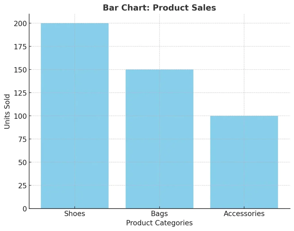
Bar charts are ideal for comparing categories or groups. They use rectangular bars where the length represents the value of the data, making it easy to compare multiple categories at a glance.
For example, imagine you’re comparing the sales of different products in your store: shoes, bags, and accessories. A bar chart shows that shoes sold 200 units, bags sold 150, and accessories sold 100. This quick comparison highlights the bestseller and which product needs more promotion. Bar charts work well for categorical data like product types, age groups, or regions.
2. Pie Charts
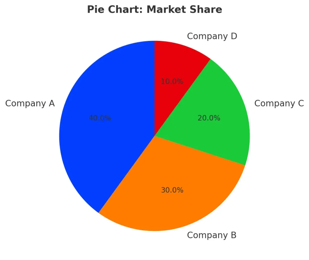
Pie charts show proportions or percentages of a whole. Each slice of the pie represents a category’s contribution to the total, making it useful for understanding how different components add up to a whole.
For instance, if a company holds 40% of the market share, and its competitors hold 30%, 20%, and 10%, a pie chart visually divides the circle to represent these proportions, making it clear who dominates the market. Pie charts work best when comparing a small number of categories with distinct proportions.
3. Histograms
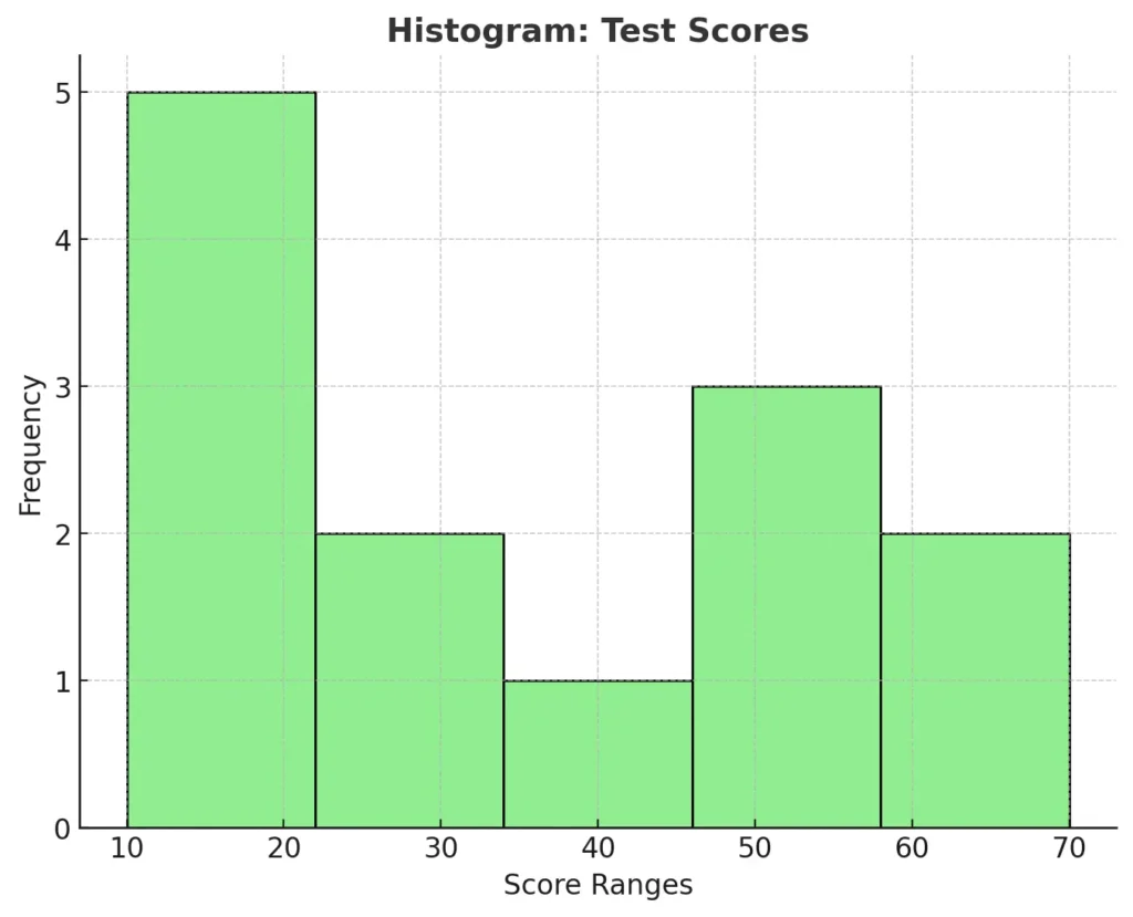
Histograms display the distribution of numerical data, grouping values into intervals (bins). They’re great for identifying data patterns such as skewness, spread, or clustering.
For example, if you’re analyzing test scores for a class, a histogram can show how many students scored within specific ranges, such as 10–20, 21–30, and so on. In our example, most students scored in the range of 20–30 and 50–60, indicating clustering around these ranges. This helps identify patterns, such as the most common score intervals and areas where students may need additional support. Use histograms when analyzing continuous data distributions like test scores or weights.
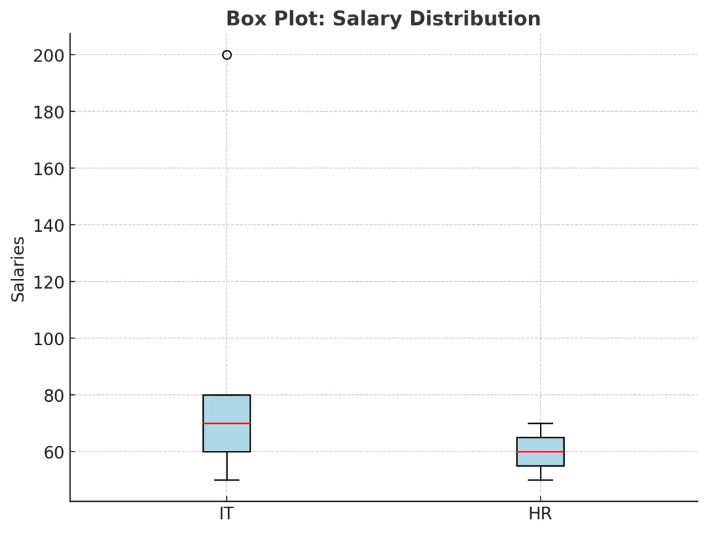
4. Box Plots
Box plots summarize data using five key metrics: minimum, first quartile, median, third quartile, and maximum. They are excellent for spotting data spread, skewness, and outliers.
For instance, comparing salaries across departments, a box plot might show that IT has a wide salary range with a few outliers (e.g., very high executive salaries), while HR salaries are more consistent. Box plots are ideal for continuous data when you need to understand variability and outliers.
5. Line Charts
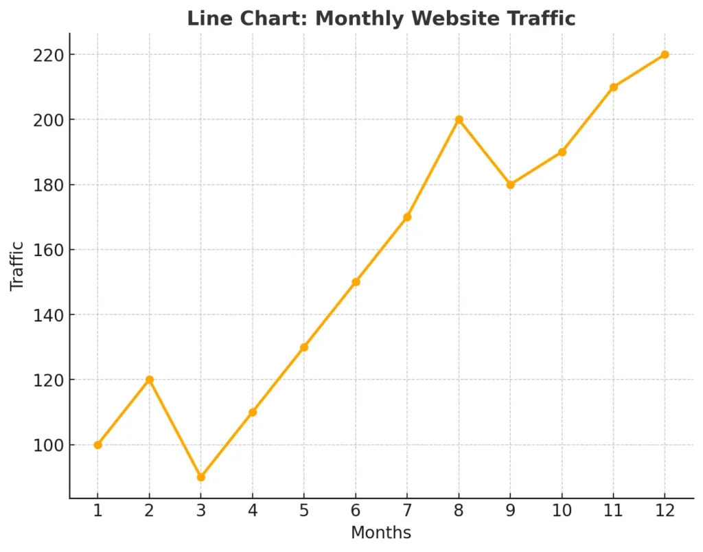
Line charts are used to show trends over time, making them ideal for time-series data. The points on the graph are connected by a line, which allows you to track changes, peaks, and dips over a specific period.
For example, tracking monthly website traffic over a year, a line chart could reveal seasonal spikes or downward trends. These insights help businesses adjust their strategies, such as increasing marketing efforts during slower months.
6. Scatter Plots
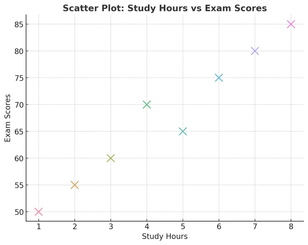
Scatter plots display relationships or correlations between two variables. Each point represents an observation, with its position determined by the values of the two variables.
For instance, a scatter plot can show the relationship between study hours and exam scores for students. If the points form a rising trend, it suggests that more study hours are linked to higher scores. Scatter plots are useful for exploring patterns and relationships in numerical data.
7. Heatmaps
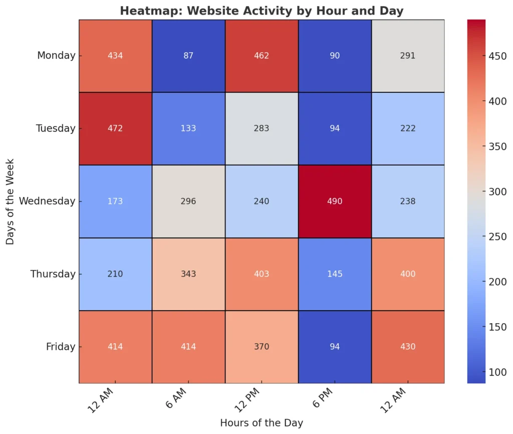
Heatmaps use colors to represent data values, making them effective for comparing variables across categories or detecting patterns in a large dataset.
For example, a heatmap of website activity could use darker colors to represent higher traffic during specific hours of the day. This can help businesses understand user behavior and optimize posting times or promotions. Heatmaps are particularly effective for analyzing data matrices or time-series patterns.
Tips for Choosing the Right Visualization
- Bar Charts and Pie Charts: Ideal for categorical data, like comparing sales by region or showing market share percentages.
- Histograms and Box Plots: Best for continuous data to analyze distributions and detect variability or outliers.
- Line Charts: Perfect for time-series data to reveal trends and patterns over time.
- Scatter Plots: Useful for exploring relationships or correlations between two variables.
- Heatmaps: Great for visualizing large datasets and identifying patterns using color.
By choosing the appropriate visualization technique, you can present your data in a way that is both accessible and impactful, enabling faster and better decision-making.
7. Basic Probability Concepts
Probability: The Foundation for Understanding Uncertainty
Probability is essential for understanding and managing uncertainty in data analysis and decision-making. It quantifies the likelihood of an event, enabling us to make predictions in unpredictable scenarios. Whether it’s forecasting weather, driving recommendation systems, or modeling business risks, probability plays a vital role in empowering data professionals to extract meaningful insights from uncertain situations.
Probability Basics with Simple Examples
Probability is expressed as a number between 0 and 1, where:
- 0 means an event is impossible.
- 1 means an event is certain to happen.
It can also be expressed as a percentage (e.g., 50% probability = 0.5).
The formula for probability is:
\( \text{Probability} = \frac{\text{Number of favorable outcomes}}{\text{Total number of possible outcomes}} \)
Example 1: Flipping a Coin
When you flip a coin, there are two possible outcomes: heads or tails. The probability of getting heads is:
\( \text{Probability of heads} = \frac{1}{2} = 0.5 \, \text{or} \, 50\% \)
Example 2: Rolling a Die
A standard die has six faces, each with equal probability. The chance of rolling a 6 is:
\( \text{Probability of rolling a 6} = \frac{1}{6} \approx 0.167 \, \text{or} \, 16.7\% \)
Types of Probability
Probability can be categorized into three main types: theoretical probability, experimental probability, and subjective probability. Let’s dive into each type in detail.
1. Theoretical Probability
Theoretical probability is based on mathematical reasoning and assumes all outcomes are equally likely. It doesn’t rely on experiments or observations. The formula is:
\( \text{Theoretical Probability} = \frac{\text{Number of favorable outcomes}}{\text{Total number of possible outcomes}} \)
Example:
In a deck of 52 playing cards, the probability of drawing a Queen is:
\( \text{Probability of a Queen} = \frac{4}{52} = \frac{1}{13} \approx 7.7\% \)
This calculation assumes the deck is fair and every card has an equal chance of being drawn.
Applications:
- Games of Chance: Theoretical probability ensures fairness in games like dice rolling, card games, and roulette.
- Simulations: It is often used in designing balanced simulations in fields like economics and logistics.
Why It’s Important:
Theoretical probability provides a framework for understanding ideal conditions, making it useful for problem-solving in controlled scenarios. However, real-world results can deviate from these predictions due to randomness and bias.
2. Experimental Probability
Experimental probability is determined by conducting experiments or analyzing actual observations. It focuses on the outcomes observed in real-world scenarios. The formula is:
\( \text{Experimental Probability} = \frac{\text{Number of times an event occurs}}{\text{Total number of trials}} \)
Example:
Suppose you roll a die 50 times and observe that the number 6 comes up 12 times. The experimental probability of rolling a 6 is:
\( \text{Experimental Probability of 6} = \frac{12}{50} = 0.24 \, \text{or} \, 24\% \)
This might differ from the theoretical probability of \( \frac{1}{6} \approx 0.167 \, \text{or} \, 16.7\% \), due to variations in the die or randomness in small sample sizes.
Applications:
- Clinical Trials: Scientists use experimental probability to evaluate the effectiveness of new medications or treatments.
- Customer Behavior: Businesses analyze experimental probabilities to understand user preferences, like the percentage of people who click on an advertisement.
Why It’s Important:
Experimental probability bridges the gap between theory and practice. It helps refine theoretical assumptions and provides insights that reflect real-world behaviors.
3. Subjective Probability
Subjective probability is based on personal judgment, intuition, or experience rather than formal calculations. It doesn’t rely on data or experiments but on an individual’s belief or expertise.
Example:
A meteorologist might say, “There’s a 70% chance of rain tomorrow.” This prediction is based on their understanding of weather patterns, historical data, and intuition. Similarly, an investor might estimate a 50% chance of a stock’s price increasing based on market trends.
Applications:
- Business Decisions: Entrepreneurs use subjective probabilities when launching new products or entering new markets.
- Medical Diagnoses: Doctors often rely on subjective probability when estimating a patient’s recovery chances based on their experience.
Why It’s Important:
Subjective probability is valuable in situations where data is unavailable or insufficient. However, it can be biased and inconsistent, so it’s best used alongside data-driven methods.
Probability Rules
Probability rules are essential for calculating and understanding the likelihood of different events, especially when analyzing data or making business decisions. These rules help us determine combined probabilities, ensure accurate predictions, and make data-driven choices.
1. Addition Rule (For Mutually Exclusive Events)
For mutually exclusive events, if two events cannot happen at the same time, the probability of either event occurring is the sum of their individual probabilities.
Formula:
The Addition Rule for mutually exclusive events is: \( P(A \text{ or } B) = P(A) + P(B) \)
Example in Business:
Imagine you’re running a marketing campaign. You want to know the probability of a customer signing up for either an email newsletter or a loyalty program. If the probability of signing up for the email newsletter is P(A)=0.4P(A) = 0.4P(A)=0.4 and the probability of joining the loyalty program is P(B)=0.3P(B) = 0.3P(B)=0.3, and these events are mutually exclusive (a customer can only do one), the probability of either event happening is:
The probability of \( A \text{ or } B \) is: \( P(A \text{ or } B) = 0.4 + 0.3 = 0.7 \)
This means there’s a 70% chance a customer will engage with one of your initiatives.
2. Multiplication Rule (For Independent Events)
If two events are independent, meaning the occurrence of one doesn’t affect the other, the probability of both occurring is the product of their individual probabilities.
Formula:
The probability of \( A \text{ and } B \) is: \( P(A \text{ and } B) = P(A) \times P(B) \)
Example in Data Analytics:
Suppose you’re analyzing website traffic and want to know the probability of two independent events: a visitor clicking on an ad (P(A)=0.3P(A) = 0.3P(A)=0.3) and then making a purchase (P(B)=0.2P(B) = 0.2P(B)=0.2). These events are independent because clicking the ad doesn’t guarantee a purchase. The probability of both events happening is:
The probability of \( A \text{ and } B \) is: \( P(A \text{ and } B) = 0.3 \times 0.2 = 0.06 \)
This means there’s a 6% chance a visitor will both click the ad and make a purchase. This insight can guide decisions on ad placement or targeting strategies.
3. Complement Rule
The complement rule helps calculate the probability of an event not occurring by subtracting the event’s probability from 1. This rule is useful in assessing risks or identifying potential gaps.
Formula:
The probability of \( \text{Not A} \) is: \( P(\text{Not A}) = 1 – P(A) \)
Example in Business Risk Management:
Imagine a logistics company forecasts a 70% probability (P(A)=0.7P(A) = 0.7P(A)=0.7) of delivering a package on time. To assess the risk, the company wants to know the probability of a delay. Using the complement rule:
The probability of \( \text{Delay} \) is: \( P(\text{Delay}) = 1 – 0.7 = 0.3 \)
This means there’s a 30% chance of delay. Knowing this, the company could plan additional resources or contingency measures to improve on-time delivery rates.
Why These Rules Matter
Understanding these probability rules helps businesses and analysts make better predictions and optimize strategies. Whether it’s planning marketing campaigns, managing risks, or improving operations, these foundational concepts provide a structured way to approach uncertainty and make data-driven decisions.
Conditional Probability
Conditional probability is the probability of an event occurring given that another event has already occurred. This is a crucial concept in many real-world applications, as it helps refine predictions based on prior knowledge or existing conditions.
Formula:
The conditional probability is: \( P(A \mid B) \) = \( \frac{P(A \text{ and } B)}{P(B)} \)
Where:
\( P(A \mid B) \) = The probability of event A occurring given event B has occurred.
\( P(A \text{ and } B) \) = The probability of both events A and B happening.
\( P(B) \) = The probability of event B occurring.
Example: E-commerce Customer Purchase Behavior
Imagine you are analyzing customer behavior for an e-commerce business. You want to know the probability that a customer will purchase a product (event A) given that they have already added an item to their shopping cart (event B). Here’s the breakdown:
- P(A): Probability of a customer making a purchase.
- P(B): Probability of a customer adding an item to their shopping cart.
- P(A and B): Probability of a customer adding an item to the cart and making a purchase.
The conditional probability of making a purchase given that the customer added an item to their cart is represented as:
\( P(A \mid B) \) = \( \frac{P(A \text{ and } B)}{P(B)} \)
Let’s assume the following probabilities:
- P(B) = 0.6 (60% chance a customer adds an item to the cart).
- P(A and B) = 0.4 (40% chance a customer adds an item and makes a purchase).
The conditional probability would be:
\( P(A \mid B) = \frac{0.4}{0.6} = 0.67 \)
This means there is a 67% chance that a customer who added an item to their cart will complete the purchase.
Why Conditional Probability Matters
In both data analytics and business problem-solving, conditional probability allows professionals to refine their predictions and decision-making based on prior knowledge. It provides valuable insights into how one event influences the likelihood of another, helping businesses optimize their strategies, improve customer targeting, and allocate resources more efficiently.
By understanding conditional probability, businesses can:
- Predict customer behavior more accurately based on past actions.
- Optimize marketing strategies, such as targeting customers who are more likely to make a purchase.
- Assess risks more effectively, like predicting the likelihood of claims in insurance or fraud in transactions.
In summary, conditional probability is an essential tool for making informed, data-driven decisions across various sectors, providing clarity in complex scenarios where events are interdependent.
Bayes’ Theorem
Bayes’ Theorem helps us calculate the probability of an event occurring, based on prior knowledge or information about related events. It’s especially useful when we want to adjust our predictions or understanding after getting new data.
Formula:
\( P(A \mid B) = \frac{P(B \mid A) \cdot P(A)}{P(B)} \)
Where:
- P(A | B) is the posterior probability: The probability of event A happening, given that event B has already occurred.
- P(B | A) is the likelihood: The probability of event B happening, assuming event A is true.
- P(A) is the prior probability: The initial probability of event A happening, before considering any new information.
- P(B) is the marginal likelihood: The total probability of event B happening.
Example: Email Marketing Campaign
Imagine you’re running an email marketing campaign for your online store, and you want to know the probability that a customer will make a purchase after clicking on the email link.
Here’s the information you have:
- Prior Probability (P(A)): From past campaigns, you know that 5% of people who receive your email end up making a purchase. This is your prior probability (before knowing if they clicked the link).
The probability of purchase is: \( P(\text{Purchase}) = 0.05 \)
- Likelihood (P(B | A)): You know that 50% of people who click on the email link end up buying something.
The probability of a click given a purchase is: \( P(\text{Click | Purchase}) = 0.50 \)
- Marginal Likelihood (P(B)): You’ve observed that 20% of people click the link in the email.
The probability of a click is: \( P(\text{Click}) = 0.20 \)
Now, you want to know the probability of a customer making a purchase given that they clicked the link.
We can apply Bayes’ Theorem to find this updated probability:
The formula for \( P(\text{Purchase | Click}) = \frac{P(\text{Click | Purchase}) \cdot P(\text{Purchase})}{P(\text{Click})} \)
Substitute the values:
\( P(\text{Purchase | Click}) = \frac{0.50 \times 0.05}{0.20} = 0.125 \)
So, if a customer clicks on the link, the probability they will make a purchase is 12.5%—much higher than the initial 5% (the prior probability of making a purchase from the email). This means that clicking the link is a strong signal that the customer is more likely to buy.
Why It’s Important in Business
Bayes’ Theorem is important because it allows businesses to update their expectations based on new data. In this case, clicking on the link is valuable information that helps refine the probability of a customer making a purchase. This helps businesses:
- Target efforts more effectively: Focus on customers who are more likely to convert after clicking the link.
- Refine decision-making: Use the updated probability to decide whether to send follow-up emails, offer discounts, or use other strategies to encourage purchases.
- Improve resource allocation: By understanding the likelihood of a purchase after a click, businesses can allocate marketing resources more efficiently.
Applications of Probability in Real Life
- Weather Forecasting:
Meteorologists use probability to predict conditions like “There’s a 70% chance of rain tomorrow.” - Sports:
Teams and players use probability to strategize, estimating the likelihood of scoring or winning based on past performances.
Example: A soccer team might analyze past games to determine they have a 30% chance of scoring in the first 10 minutes. - Healthcare:
Doctors calculate probabilities to determine treatment outcomes. For instance, “This treatment has a 90% success rate for patients with similar conditions.” - Gaming and Lotteries:
Casinos use probability to ensure games are fair yet profitable. Similarly, lottery systems rely on extremely low probabilities to determine winners. - Machine Learning:
Probability powers algorithms such as:- Spam Filters: Assign probabilities to emails being spam or not spam.
- Recommendation Systems: Predict the likelihood of a user enjoying a product.
- Fraud Detection: Estimate the likelihood of a transaction being fraudulent.
8. Conclusion
For data professionals, an introduction to statistics and probability is essential for making informed decisions, analyzing trends, and solving real-world problems. Whether it’s leveraging descriptive statistics to summarize data, applying inferential statistics to make predictions, or utilizing Bayes’ Theorem to refine those predictions, these core concepts in statistics and probability help uncover valuable insights hidden in raw data.
By mastering these techniques, professionals can reduce uncertainty, optimize strategies, and drive better outcomes across a wide range of industries. From understanding how probability distributions shape real-world phenomena to interpreting statistical tests that validate hypotheses, data practitioners who harness statistics and probability will be well-equipped to make smarter, data-driven decisions and confidently navigate the complexities of any data challenge.
9. Resources
- Khan Academy: Statistics and Probability
- StatQuest with Josh Starmer: YouTube Channel
- Coursera: Statistics Courses
- Harvard Online: Introduction to Probability


I always leave your blog feeling smarter and more inspired. That’s the hallmark of truly excellent writing.
Nice share